Marketing Suite improvements

Some of you might have already noticed it: the sending dialog of the Marketing Suite has been updated! The new sending dialog has a new look and feel and can be found under the “Mailing wizard” section in the menu of the Template Editor. Besides the fact that the new sending dialogue has an updated look, there are a number of other visible changes that improve the user experience. These are briefly mentioned below.
- Scheduling mailings has been improved. In the previous sending dialogue, the scheduled mailings were displayed in a text form. In the new sending dialogue, the scheduled mailings are displayed in an intuitive calendar which provides a better overview. In addition, when scheduling upcoming mailings, differences in time zones are now taken into account.
- Selecting a target destination is easier. Previously, users had to go through multiple dialog screens and lists before selecting a definite target destination. Now this is possible with only a few clicks.
- Adding tags to mailings has been simplified. Adding tags to a mailing makes it easier to find specific mailings in the future.
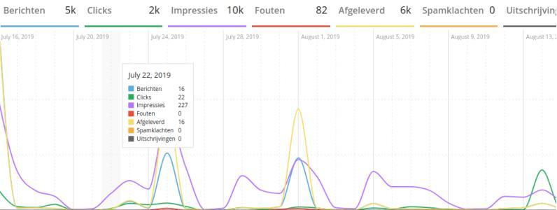
Apart from the changes in the sending dialog, several adjustments have been made to the Marketing Suite dashboard as well. The new dashboard does not only have an updated look and feel, but it also performs better since the code in the background has been improved.
Have you had a chance to check out the new sending screen and dashboard yet? What did you think of it? Any comments, suggestions and questions can always be sent to info@copernica.com


