Quick tip: How to hide mobile content in desktop email clients
by Clayton van Oostwaard
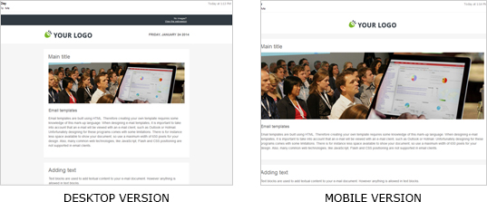
Let's say I have a very informative email with mixed content for mobile and desktop email clients. And I would like to hide the mobile content from my recipients who open the email in desktop email clients like Outlook or Gmail.
The use of display: none is the first thing that comes to mind. Unfortunately, Gmail and Outlook don't play well with this setting. If I were to use display: none, recipients using Gmail or Outlook will still see the content I wanted to hide in the first place!
For the sake of this tip I've kept my email template example very simple. The first thing you want to do is give the container with the mobile content a class in order to assign it a couple of CSS rules. Those CSS rules will make sure the mobile content is hidden.
How do you hide the mobile content?
It’s not too hard. By following the next steps, you’ll be able to hide whatever mobile content you don’t want your desktop users to see. I have prepared table cells with content for mobile and desktop email clients. And one table cell especially for mobile email clients.
<table>
    <tr>
        <td>Content for mobile & desktop</td>
    </tr>
    <tr>
        <td>Content for mobile</td>
    </tr>
    <tr>
        <td>Content for mobile & desktop</td>
    </tr>
</table>
Just a walk in the park this far. The next step is to give both the table row and table cell containing the mobile content a CSS class you are going to use to hide it. In my case I've named the class 'mobileContent'. The reason why I gave both the table row and cell the same class, is because I want to hide everything that is linked to the mobile content. If you would leave out the table row, you’d see a large gap between the mobile/desktop content parts.
<table>
    <tr>
        <td>Content for mobile & desktop</td>
    </tr>
    <tr class="mobileContent">
        <td class="mobileContent">Content for mobile</td>
    </tr>
    <tr>
        <td>Content for mobile & desktop</td>
    </tr>
</table>
And now for the CSS. Because Gmail and Outlook email clients ignore display: none, we are going to add extra CSS rules to hide the content. I'm assuming you are familiar with these CSS rules so I'm not going to go into further details. But if you would like to know more, leave a comment and I'll get back to you. The CSS rules for hiding my mobile content is:
.mobileContent {
    display: none;
    font-size: 0;
    max-height: 0;
    line-height: 0;
    mso-hide: all; /* hide elements in Outlook 2007-2013 */
}
Since we are hiding mobile content in desktop email clients, we need to make sure that content is shown on mobile email clients. So make sure you have that covered inside the media query for mobile email clients. You can read more about responsive email templates on our blog. So that means our CSS rules will look like:
@media only screen and (max-width: 480px) {
    .mobileContent {
        display: block !important;
        font-size: 12px !important;
        max-height: none !important;
        line-height: 1.5 !important;
    }
}
Will it also work with images?
Unfortunatly these CSS rules don't apply to images. If you want to hide images on desktop email clients you will need a different approach. Just apply the CSS below to images you would like to hide.
img {
    max-height: 0;
    width: 0;
}
And don't forget to reset your media query so that mobile email clients will show your images the way you want them to be displayed.
@media only screen and (max-width: 480px) {
    img {
        max-height: none !important;
        width: auto !important;
    }
}
I hope this helps. Drop a comment if you've used it in one of your projects or if you want to find out more.


