


Responsive design: preparing your emails for mobile
 In the last three years the use of smartphones has skyrocketed. That is why email marketers need to pay extra attention to optimizing their emails for mobile use and to monitor the use of smartphones within your target group(s). But the stats speak for themselves: more and more people have one or more mobile devices that they use to go online and to open their emails.
A few of these stats:
- In the age group of 18 to 24, the use of web-based email in the US decreased by 34% and the use of mobile email increased with 32%. – Comscore (February 2012)
- People currently read emails more on a mobile device instead of using a desktop based email program or via webmail. According to research, 38% of all emails are opened on a mobile device, 33% on a desktop and 29% in webmail.– Litmus - (October 2012)
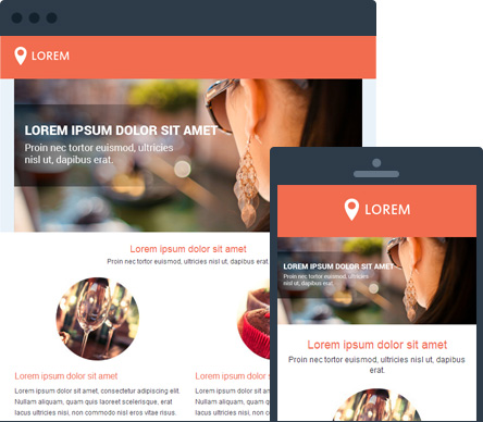
There are still a too little number of organizations that take the increasing use of mobile seriously. Emails and websites are mainly optimized for desktop use. And when doing so, they forget to optimize the design for mobile. By applying responsive design, you can solve this problem and prepare your websites and emails for mobile use.
What is responsive design?
Responsive design is a design technique in which a special CSS3 code is used called “media queries”. Using these media queries, you can easily determine what style is applied when your email or website is opened on a digital device such as a smartphone.
 <style type="text/css">
   @media only screen and (max-device-width: 480px) {
 /* mobile-specific CSS styles go here */
 }
   /* regular CSS styles go here */
 </style>
In this media query, the variables you formulate in your code are checked. In this case it will check if your email is opened on a screen and if the width of the screen is larger or smaller than 480px. When the width is smaller than 480px, the CSS code for the mobile screen will be used. If the width is larger than 480px, the normal CSS code is used.
Responsive design basically means that the content and layout of your email is adjusted based variables such as your screen size, resolution and orientation of the screen (landscape or portrait). This improves the user experience for both your users who read your emails on a desktop or webmail and those who read your email on their mobile device.
Difference between responsive & fluid design
If you have been in the business of email marketing and designing email (templates) for quite some time, you know there is a large tendency for using fluid design when optimizing emails for different devices. Then you probably understand what the difference is between fluid and responsive design.
The most important difference is the use of percentages in fluid design. This is used to adjust the content proportionately for different screen sizes. For example: width=”90%”.
Responsive design uses the CSS media queries to adjust the content and layout based on screen size (or type of screen, orientation,…). This means you have a lot more control of your layout compared to fluid design.
How do I apply responsive design?
To get an even better idea of how responsive design works, it is best to formulate an example.
Letting the content fill up your entire screen
You’ll often hear that you have to keep the design of an email as simple as possible. It is recommended you use one column in the design of your emails. When doing so, it is important to make sure the content fills the entire screen. This provides the email with a clean and decent look. In this case, your HTML code can look this:
 <table cellpadding="0" cellspacing="0" border="0" id="mainContent">
    <tr>
     <td><img src="header.jpg" alt="" class="bodyImage" /></td>
    </tr>
    <tr>
      <td class="bodyContent">Message</td>
    </tr>
 </table>
The classes you appoint to each table cell are also found in your media query. The classes mainContent, bodyImage and bodyContent make sure your content fills the full width of the screen. Your media queries will look like this:
 @media only screen and (max-width: 540px) {
 table[id=mainContent] {
 max-width: 600px !important;
 width: 100% !important;
 }
 }
 @media only screen and (max-width: 540px) {
 img[class=bodyImage] {
 height:auto !important;
 max-width: 600px !important;
 width: 100% !important;
 }
 }
@media only screen and (max-width: 540px) {
 td[class=bodyContent] {
 font-size: 14px !important;
 line-height: 125% !important;
 padding-right: 10px;
 padding-left: 10px;
 padding-top: 0 !important;
 }
 }
When do I use responsive design?
 Before you spend too much time and effort in optimizing your emails (and websites) it is best to know who you are doing this for. Does your target group read their emails on their smartphone or tablet? That is why it is crucial you analyze your database first and you check the reports of your email campaigns to see if the use of responsive design is needed.
You could ask your recipients if they want to receive a mobile version of your email by using a web form or by asking them via your newsletter. Or you could ask them right away when they subscribe for your newsletter.