Remove unwanted gaps in Microsoft Outlook
by Clayton van Oostwaard
In some cases, Outlook 2007 and 2010 magically render unwanted gaps in your HTML email. Especially when you're using two columns and your email is supposed to be responsive. Are you running into this little problem? Hopefully this article will help you fix it once and for all.
The problem
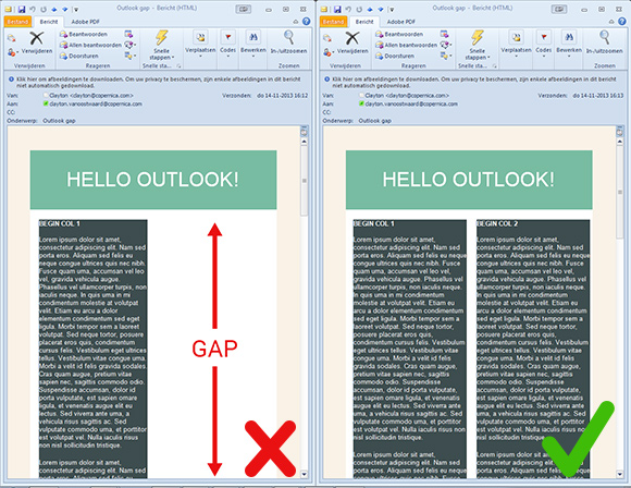
If your email looks like the one with the red X in the screenshot below, you probably are a victim of how Outlook 2007 and 2010 renders HTML emails.

The cause
At first it may look like someone forgot to tell the table cells ('<td>') to vertically align ("valign=top") everything to the top. But this problem occurs in different setups e.g. nested tables inside a larger table or when you have two or more columns that stretch very long in height. But the bottom line is, if one table/column stretches way too long, around 1600px according to my tests, Outlook makes a boo-boo.
Example code
The HTML code structure used in the example above is as follows:
By the way, I left out any styling because I just want to show you the structure of the email you saw in the screenshot earlier.<!-- Main (large) table: holds everything inside together -->
<table border="0" cellpadding="0" cellspacing="0" width="500" summary="Main table">
<tr>
<td>
<!-- Header and columns table: holds the title and columns of this email -->
<table border="0" cellpadding="0" cellspacing="0" align="center" width="500" summary="Header table">
<tr>
<td align="center">Hello Outlook!</td>
</tr>
<tr>
<td>
<!-- Column table: first column of this email -->
<table border="0" cellpadding="0" cellspacing="0" align="left" width="45%" summary="Column 1">
<tr>
<td>A lot of content</td>
</tr>
</table>
<!-- Column table: second column of this email -->
<table border="0" cellpadding="0" cellspacing="0" align="right" width="45%" summary="Column 2">
<tr>
<td>A lot of content</td>
</tr>
</table>
</td>
</tr>
</table>
</td>
</tr>
</table>Looks normal, doesn't it? Sadly the outcome is a bit different.
Solutions
One solution is quite simple: just write less content. Plain and simple. But you and me both know that's not going to happen. So luckily, there are a few other things you can do.
Solution #1: Collapse your tables
This is the most simple and quickest fix you can use. By collapsing your tables with border-collapse you remove any space and borders between the table cells, so you are left with only one border. In some cases there is not enough room to align two columns next to each other, so one column pushes the other away.
table {border-collapse: collapse;}Solution #2: Don't nest tables and use TD instead of TABLE for columns
Too be honest, this fix is only useful if your email doesn't have to be responsive. The truth is, you can't easily stack two TDs on top of each other like the responsive approach. However, by using TDs you remove an extra table that can increase in height and eventually break down in Outlook. Also, if you're using a main table around your email as a background layer, you can replace that table with a span tag set to display block. This way you can still add a background color.
So instead of using tables:
<table border="0" cellpadding="0" cellspacing="0" align="left" width="500" summary="Columns table">
    <tr>
        <!-- Column table: first column of this email -->
        <table border="0" cellpadding="0" cellspacing="0" align="left" width="45%" summary="Column 1">
            <tr>
                <td>A lot of content</td>
            </tr>
        </table>
        <!-- Column table: second column of this email -->
        <table border="0" cellpadding="0" cellspacing="0" align="right" width="45%" summary="Column 2">
            <tr>
                <td>A lot of content</td>
            </tr>
        </table>
    </tr>
</table>
You should use tds like this:
Don't forget to add valign="top", otherwise the shortest column will start at the middle of the tallest column.<table border="0" cellpadding="0" cellspacing="0" align="left" width="500" summary="Columns table">
<tr>
<td valign="top">A lot of content</td>
<td valign="top">A lot of content</td>
</tr>
</table>Solution #3: Use conditional statements to target Microsoft Outlook in general
This fix works best if your email needs to be responsive, which means that you are probably using tables that align to the left and right if you are going for the 2-column look. In the end, this solution is similar to solution #2, because you'll be using TDs instead of tables.
Wait...what? Conditional statements?
Have you ever used conditional statements to target e.g. Internet Explorer 6 when building a website? Good news! You can also target Microsoft Office (Outlook).
For example:
<!--[if gte mso 9]>
    <style type="text/css">
        Microsoft Office (Outlook) specific CSS goes here
    </style>
<![endif]-->
The keyword 'mso' stands for Microsoft Office. Using 'gt' and 'lte' will target versions greater than, or less than or equal to, respectively. You're basically telling versions of Outlook that are greater (or later) than 2000 to use your special CSS. Here's a list of Outlook versions that correspond to the version number you can use in the conditional statements:
- Outlook 2000 - Version 9
- Outlook 2002 - Version 10
- Outlook 2003 - Version 11
- Outlook 2007 - Version 12
- Outlook 2010 - Version 14
- Outlook 2013 - Version 15
Let's put the conditional statements to good use. Like I said before, this solution is similar to solution #2. We need to remove nested tables whenever the email is opened in Outlook. Readers using Outlook as an email client won't notice any difference, unless they dive into the code.
I'll be targeting non Outlook clients to use the nested tables. Targeting non-Outlook clients is easy, just use '!mso' instead of 'gte mso 9'. With '!mso' you are littererly saying 'not microsoft office'.
<table border="0" cellpadding="0" cellspacing="0" align="center" width="500" bgcolor="#FFFFFF" summary="">
    <tr>
        <!--[if !mso]><!---->
            <td>
                <table border="1" cellpadding="0" cellspacing="0" align="left" width="45%" summary="">
                    <tr>
                        <!--<![endif]-->
                            <td valign="top">
                                A lot of content
                            </td>
                        <!--[if !mso]><!---->
                    </tr>
                </table>
        <!--<![endif]-->
        <!--[if !mso]><!---->
            <table border="1" cellpadding="0" cellspacing="0" align="right" width="45%" summary="">
                <tr>
                    <!--<![endif]-->
                        <td valign="top">
                            A lot of content
                        </td>
                        <!--[if !mso]><!---->
                </tr>
            </table>
        </td>
    <!--<![endif]-->
    </tr>
</table>
Have fun testing!
If you have anything to add, or need any help, please let me know in the comments section.


