What to keep in mind to create a good landing page?
by Clayton van Oostwaard
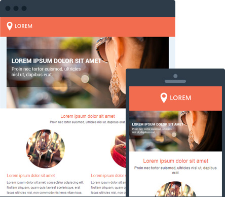
A landing page is a web page that a visitor will 'land' on when clicking on a call-to-action on another website, banner, hyperlink in an email or search result. It is also possible to reach such a landing page via a special promotional URL that has been included in offline communication (for example, on a flyer). This page consists of predetermined and relevant content which is consistent with the call-to-action. The content has been placed on the page for a specific goal (for example, conversion, collecting customer data,...).
The focus points of a landing page
Consistency
To maintain a consistent look and feel, the landing page contains the same style elements as the rest of the website and the campaign. The visitor must be able to see that the landing page is part of the entire campaign.
One goal per landing page
A landing page is not too crowded. Focus on one goal only. For example, requesting more information from a customer, registering for a newsletter or selling a product. Mainly because this is the reason why the visitor ends up on the page coming from the marketing campaign. Make it scannable, as is the rule for every web page. The visitor has to know what to do with just one glance. So keep it brief and concise (Keep It Simple Stupid).
Clear call to action
A landing page doesn't contain that many links. Links to other parts of your website will distract the visitor. It will keep him from the reason why he originally visited the page and the goal you would like to achieve. Therefore, you should offer a prominent call-to-action on the landing page. The landing page has one particular goal that needs to be fulfilled. You have to be able to clearly distinguish that goal on the page. For example, make sure the call-to-action can be seen at the top of the screen. This way, the visitor will not have to scroll down to find your call-to-action.
Trust
To gain trust, the landing page must contain enough information to convince doubting customers. Keep in mind not to use too much information. You might distract the visitor and the page might seem too crowded. Adding warranty claims, contact data and quality labels (if you are a member of such organizations, for example Return Path or the DDMA) will also help gain the customer's trust.
Put it above the fold
The most important part of the landing page is shown immediately. When a visitor doesn't find what he is looking for, he will gone within seconds. Make sure he does not need to scroll down for the call-to-action. Het belangrijkste onderdeel van de landingspagina staat direct in beeld. Assign a specific page that matches your campaign. It might be an idea to rebuild an existing page and turn it into a landing page. Never refer to the home page or an overview. As stated before, if a visitor doesn't find what he's looking for, he'll leave and won't come back.
Personalize if possible
Personalize the landing page if possible. One of the readers of your newsletter decides to click on a link to register for an event? Fill out his data in advance. A regular client uses a landing page to click through to your webshop? Show offers that only match his previous purchases.
Track results
To measure is to know. Each marketing campaign has an objective and matching KPI's (key performance indicators). For example, always keep measuring the number of people who visit your landing page and how this affects your conversion. Ask yourself what costs a lead or sale may generate and what results you would like to get from the landing page. Try to vary what you measure once in a while and monitor these results closely. This helps you optimize your landing pages continuously.
Use your website statistics (via Google Analytics or the marketing software) to see what pages on your website generate the most traffic. Optimizing these pages will also help you increase conversion and visits to the website.


