Information sharing: the threshold and the open door
by Jenny Peters
How do you place information on your website? Do you open the doors wide to gain trust from visitors and potential customers? Or do you lay down a threshold so you can collect leads?
On the one hand you want to publish lots of information: your catalogue to show what you can do, your rates to present yourself as the cheapest, whitepapers to display your expertise, etcetera. Rumour has it that an information seeker on the internet will be gone fast if he doesn't find what he wants, when he wants it. Moreover a website visitor will be impressed with your transparent organization and therefore inclined to get in touch or make a purchase.
On the other hand you want to register a website visitor to pursue him as a lead and to update him in the future. But the only way to do that is by laying down thresholds: presenting information behind login screens or application forms so you can collect data.
The answer to this dilemma lies in an old comparison: consider your website as a shop window. It's a cliché but it still applies, especially in the sharing of information. Consider your website to be a large window in which you can display your merchandise, your personality and your atmosphere. But to get inside the visitor will have to cross that threshold. It's up to creative marketers to ensure the visitor doesn't trip over it.
Matter of perception
If you can't see a threshold, it's not there. You can remove the threshold of information requests from visibility by focussing on the website visitor. For example with a newsletter application: "Tell us which topics have your special interest, and we'll only inform you about those topics". And voilà, you've not only captured an e-mail address, but also learned how to tickle your new subscribers interest. Of course, you'll have to adjust your newsletter to different focus groups as well, but that's always a good idea.
When sharing expertise it's a bit harder to justify why you place a threshold. "Goes around, comes around" doesn't sound too friendly. The trick is to emphasize the importance of registering to the requester. Because the brochure will be specified to his field of employment, the whitepaper is composed for him personally, or the research results will be compared to his own answers.
Teasing
What we all want is to entice the visitor so much with our product, service or organization that they absolutely want to get inside our skin. A website can be very inviting by withholding information. For example by making advisory documents partly public, but the full text is only disclosed through e-mail. Or offer your catalogue online, but current discount are only available on request. These are examples, the best way to tease differs per brand, product and service, which is why creativity is required. A marketer spends much of his time dressing up information in the most inspiring manner.
Reward good behaviour
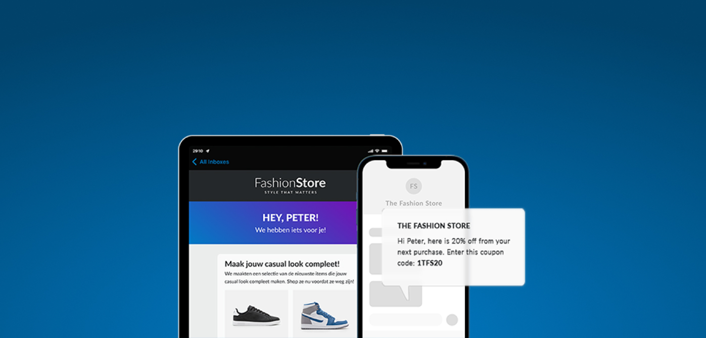
Another way to remove the threshold is to reward a website visitor for leaving behind his data. This may be a manner of perception, I could experience receiving an 'exclusive report' as a reward. More tangible options are special offers for registered members, a coupon upon subscription or a free gift with an inquiry.
The most important thing is to be conscious of the value of information and how you share it. A website offers many chances to draw leads if you manage the boundary between sharing and ensnaring just right. More tips are available through our whitepapers, all we require is your e-mail address...;)


